Data integration, transformation, and visualisation using pandas
Published 2020-01-12
Table of Contents
In this post I will demonstrate how to we can use Python’s go-to data manipulation module pandas to join multiple data sources, perform some basic transformations (aggregation, pivots, etc.), and visualise the data.
For each example, I will provide a sample code snippet. However if you would like to see the code and data for this tutorial in full, you can view/clone it from my GitHub repository.
Dataset
The dataset I will use for this tutorial is the superstore sales dataset. This dataset contains contains information on the sales made by a fictional retail outlet in the USA. The dataset is provided in .xls format and the data is spread across three different sheets:
-
Orders: This is the main table in the dataset and contains information for each order such as the order id, the store location, the quantity, and the profit.
-
Returns: This table contains a list of order id’s which have been returned.
-
People: This table contains the names of the regional manager for each region contained within the orders table.
We can think of these sheets as three tables in a database. We can easily read each of these sheets into memory using pandas and examine the first few lines as demonstrated below.
import pandas as pd

orders = pd.read_excel('./data/input_data/superstore.xls', sheet_name='Orders')
returns = pd.read_excel('./data/input_data/superstore.xls', sheet_name='Returns')
people = pd.read_excel('./data/input_data/superstore.xls', sheet_name='People')

# view the first few lines of the data
orders.head()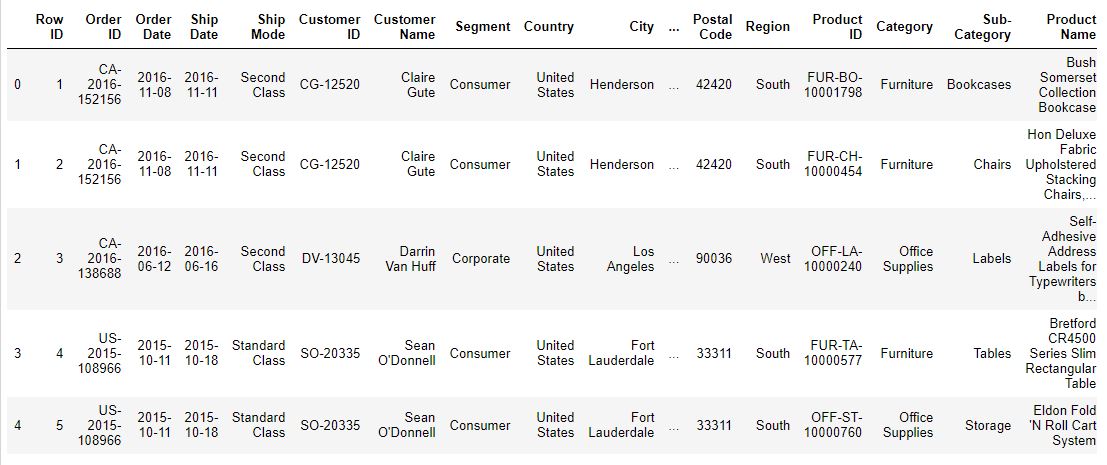
returns.head()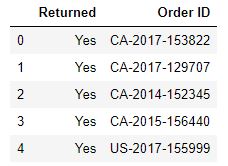
people.head()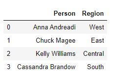
Joining our data sources together
If you load and explore the data sources you will notice that the orders table shares common fields with both the returns (Order ID) and people (Region) tables. These relationships mean that we can combine the three data sources into a single “master” table using a join.
Pandas makes joining tables very simple through the merge. This allows us to join two tables using two or more columns and specify the type of join (inner, left, right, outer) we wish to use.
merged_df = orders.merge(
    returns, how='left', on='Order ID'
    ).merge(people, on='Region')
The code above demonstrates how one would go about joining our three data sources together into one master table (merged_df). A few key points to note:
-
The dataframe we apply the .merge method to (orders in our case) is considered the left table in the join while the dataframe inside the parenthesis (returns and people in our case) are considered the right.
-
We can perform both joins in a single line by simply chaining the
.merge()operations together. -
By default the merge method preforms an inner join. However since the returns table only contained information on returned orders an inner join here would mean that we would have lost all the non-returned orders from the orders dataset. As a result of this we had to specify that we wanted to use a left join. Since we knew that all regions in the orders dataset appear in the people dataset we were comfortable using an inner join when merging the people dataset. If you are unfamiliar with these joins, see below for a visual explanation.

Some basic filtering
Once we have our datasets merged together, the next logical step might be to filter out rows which relate to returned orders (i.e order ID’s which exist in the returns table) as we might consider these invalid for our analysis.
Pandas makes filtering incredibly easy using the loc method. This method allows us to access a column, or a group of columns using a boolean index.
When using the loc method, we declare our boolean index as the first input, followed by the group of columns we wish to select from the filtered subset.
In the example below, I use the loc method to filter the dataframe based on rows which have a NA value for the column’Returned’ (since these are the ID’s which are not in the returned table). I then specify that I want to select all columns using the : slicer.
not_returned_df = merged_df.loc[merged_df['Returned'].isna(), :]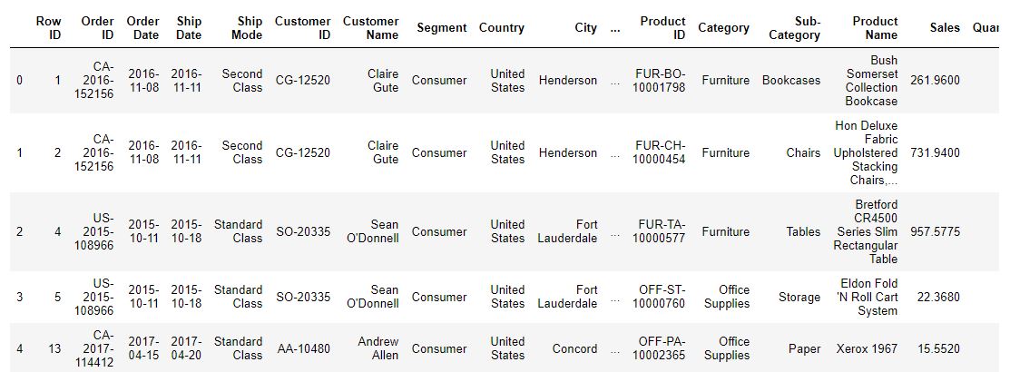
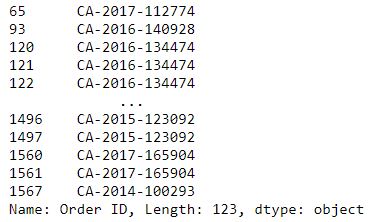
In addition to performing simple filtering base on the values in one column we can also chain logic together across multiple columns. Using the code below, we can extend our example from above to identify the order ID’s of non-returned items in the city of Jacksonville.
not_returned_jax = merged_df.loc[
    (merged_df['Returned'].isna()) &
    (merged_df['City'] == 'Jacksonville'),
    'Order ID'
]
It is also worth nothing that pandas provides an iloc method which allows us to filter dataframes based on row/column indexes. This method can be particularly useful when it comes to taking slices of large datasets. You can read more about this method in the pandas documentation.
Aggregating the dataset
When exploring a dataset it is often useful to aggregate the data up to a particular column value and view the data at a higher level.
For example, if we want to explore the mean profit per item in each region we can use the groupby method (illustrated below) to group the dataset by the region column before specifying that we want to see the mean of the “Profit” column.
agg_example_1 = not_returned_df.groupby(
    by='Region'
)['Profit'].mean()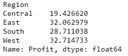
Of course oftentimes we want to look at different values and metrics across multiple columns when summarising the dataset. Pandas allows us to do this by combining the groupby method with the agg method. This allows us to specify different aggregations (mean, median, sum, etc.) for each column we wish to summarse.
I have illustrated this in the example below by aggregating the data up to region level before calculating the mean profit and median sales within each region
agg_example_2 = not_returned_df.groupby(
    by='Region'
).agg({'Profit':'mean', 'Sales':'median'})
Pivoting & unpivoting the dataset
Pivoting
Similar to aggregating the dataset, a pivot can often be useful when summarising a dataset for a report. Pivoting involves turning a single column into multiple columns (1 for each value in the original column). This idea can be difficult to understand but let’s illustrate this by using the pivot method in pandas. In our example we use the groupby method to calculate the profit per manager for each product category before using a pivot to display the results in a more readable format.
# group by person and category to aggregate
data_for_pivot = not_returned_df.groupby(
    by=['Person', 'Category']
)['Profit'].sum().reset_index()

# perform pivot
data_for_pivot = pd.DataFrame(
    data_for_pivot.pivot(
        index='Category',
        columns='Person',
        values='Profit'
).to_records())

data_for_pivot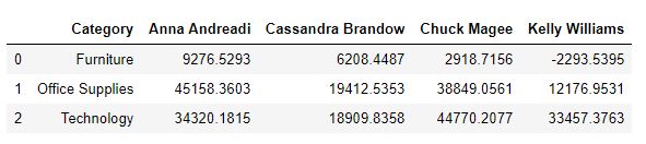
Some notes on the above:
-
The
to_recordsmethod is used to convert the data into a tabular format for output to a dataframe. -
You may also be interested in reading up on the pandas
crosstabmethod which can achieve the same output as the code above.
Unpivoting
While a pivot may be useful for summarising and visualisng a dataset, they are often a nuisance to deal with from an analytical perspective. For instance, if we want to see the total profit for furniture in our above example we would have to filter the data to furniture before summing together 4 different columns.
In a previous role, I found myself receiving data from accountants who insisted on extracting the data in a pivoted format as it was easier for them to interpret. In these situations, the first step in my data transformation process always involved unpivoting the data to get it from “wide” to “long” format. Once again, pandas makes this operation very straight forward with the (you guessed it) unpivot method.
In the below example, I use the unpivot method to transform out pivoted data from the example above back into it’s original aggregated state. You will see that all I had to do was specify which columns I didn’t want to unpivot in the id_vars parameter.
unpivoted_data = data_for_pivot.melt(id_vars=['Category'])
unpivoted_data.columns = ['category', 'person', 'profit']

unpivoted_data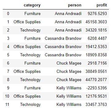
Applying a custom function to a dataframe
Oftentimes when transforming a dataset we will want to apply a function we have created to a dataframe. Some examples of this include:
-
A function that will convert an address column to coordinates
-
A function that will create a binary flag based on some logical condition
-
A function that will convert a text column to a vector representation
Pandas allows us to do this using the apply method with lambda. This method will simply loop through each row of the data and apply our function the column(s) we specify. For example we can use the code below to create a "special_offer" column by applying a function which determines if an item has a discount rate of > 50%, and if so it returns a 1.
def special_offer(discount):

    if discount > 0.5:
        return 1
    else:
        return 0

not_returned_df.loc[:, 'special_offer'] = not_returned_df.apply(
    lambda row: special_offer(row['Discount']), axis=1
)
Note that when applying a custom function it is important to include the lambda within the method. It is also important to note that setting axis = 1 indicates that we want to loop through the dataframe row-wise instead of column-wise.
A very important note on the creation of binary columns using custom functions
While it is great to be able to leverage the apply method for custom functions on our dataframe, it is important to remember that this method is essentially just looping through every row of the dataframe and applying the function over and over. This can often result in long wait times when dealing with larger datasets so it is important to be smart about how and when we use the method.
For example, when creating a binary column it is more computationally efficient to create a column filled with zeros, then use the loc method to filter to the columns which meet our criteria and set them to one.
You will see in the code and output below that using this method for our simple function takes much less time than the apply method approach.
# apply approach
start_time_loc = time.time()
not_returned_df.loc[:, 'special_offer'] = 0

# loc approach
not_returned_df.loc[not_returned_df['Discount'] > 0.5, 'special_offer'] = 1
print ("Time to run .loc method:", time.time() - start_time_loc)
Plotting a dataframe
Visualisation is a key part of the data exploration process and should be used in every data science task. While modules such as matplotlib, seaborn, and plotly allow us to produce some lovely, clean visuals for reports and presentations, sometimes we just want to pull together something quick and examine a particular feature in our dataset. In these cases I will always try to use the pandas plot method as it is incredibly simple and effective.
In the examples below you can see how we can apply this method to very easily to create a histogram of sales prices (< 1000 due to large tail) and and a scatter plot (sales vs discount). These types of visuals can be extremely helpful when understanding how a dataset is distributed, identifying outliers, and understanding correlations.
ax = not_returned_df.loc[not_returned_df['Sales'] < 1000, 'Sales'].plot.hist(bins=50)
fig = ax.get_figure()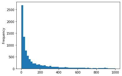
ax = not_returned_df.plot.scatter(x='Sales', y='Discount')
fig = ax.get_figure()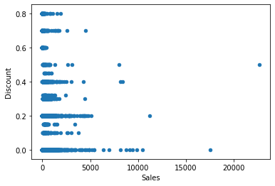
Exercises
If you would like to practice the concepts and methods discussed above I have listed a number of sample exercises below for you to test and improve your skills:
-
Join the datasets together in such a way that you are only left with information for returned orders
-
Filter the dataset to find orders with a sales values < 500 in the bookcases or tables sub-category.
-
Aggregate the data to show the mean profit per sub-category
-
Aggregate and pivot the data to show the profit for each shipping method (rows) in each sub-category (columns)
-
Unpivot the data in exercise 4
-
Create a function which identifies if an item was shipped within 3 days of ordering and apply it to the dataset
-
Create a bar plot of the number of orders per category
While these examples will give you some more exposure to pandas, I would also recommend that you find a dataset that interests you online and use pandas to explore, summarise, and visualise it!
Closing thoughts
Pandas is an incredibly powerful and intuitive module capable of performing data transformation, summarisation, and visualisation. While many people like to talk about the incredible work they are doing in TensorFlow, Keras, PyTorch, etc. they often do not mention how important pandas was in transforming their data. I for one spend about ~80% of my time in pandas during every data science project I work on.
I hope that this post has helped you get a basic understanding for how to use pandas in your projects, and if you are looking to learn more about what pandas can do I would recommend visiting the module’s documentation page.
Once again, the code and data used for this post are available from my GitHub repository.